
Well-designed micro market signage increases product discovery, smooths customer flow, and drives a measurable sales lift, backed by an 8.1% average lift in purchase probability for featured products in a recent field experiment. Industry guidance and Jeeves Vending’s own installations point the same direction: prioritize entrance and kiosk messaging first, because that’s where hesitation costs you the most sales.
TL;DR:
- Entrance and kiosk messaging should be prioritized, as they generate the highest return on customer engagement and purchase probability.
- Signs must be readable from appropriate distances, with material durability and high contrast to maintain effectiveness over time.
- Digital screens should limit text, use high contrast for item names and prices, and match promotional content with physical product placement.
- Consistent wording across all touchpoints and strategic placement before decision points enhance shopper comprehension and reduce theft.
- Integrating signage into design from the start improves performance and reduces long-term maintenance, especially when paired with remote monitoring and support.
Table of Contents
- Why Micro Market Signage Matters More Than Operators Think
- What Are the Best Physical Sign Design Rules?
- How Should Digital Kiosk Screens Be Designed?
- Where Should Wayfinding and Shelf Signs Go?
- What Signage Wording Actually Converts and Cuts Shrink?
- Quick Implementation Checklist for a Signage Refresh
- How Jeeves Vending Approaches Signage in Real Installations
- Where To Focus First When Budget or Time Is Tight
- Get Signage Built Into Your Micro Market From Day One
- Sources
- FAQ
Why Micro Market Signage Matters More Than Operators Think
Signage isn’t decoration in a self-service market. It’s the only sales rep on duty. A 2026 field experiment found digital signage lifted purchase probability for featured products by 8.1% on average, with related grocery case studies showing sales jumps as high as 33% on featured items. That gap between average and peak performance comes down to placement and clarity, not luck.
In an unmanned retail space, signage does the job a cashier or floor associate would do elsewhere: it points shoppers toward what’s new, explains how checkout works, and nudges hesitant buyers toward a decision. Skip that step and dwell time increases while conversion drops, especially for first-time users who don’t know how the kiosk works.
Three numbers worth tracking after any signage change:
- Conversion rate (visits to purchases) at the kiosk
- Average basket size on featured versus non-featured items
- Shrink percentage, since confusing layouts and unclear inventory messaging both invite theft
Track these for two to three weeks before and after a signage update. Anything less makes it hard to separate a real lift from normal day-to-day noise.
What Are the Best Physical Sign Design Rules?
Printed signs earn their keep only when someone can read them from where they’re standing. The trade rule of thumb: about 1 inch of capital-letter height for every 10 feet of viewing distance, or roughly a few inches tall for anything read from typical customer viewing distances. Undersized signs are the single most common mistake in micro market installs.
Materials matter almost as much as sizing:
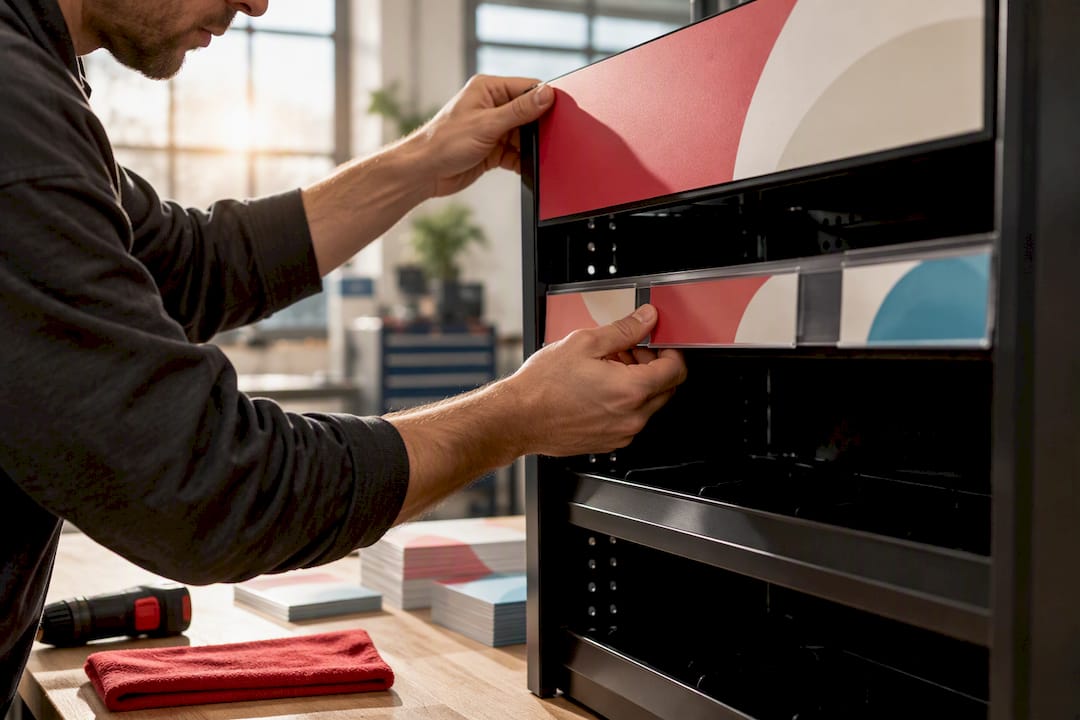
- Laminated cardstock or vinyl clings for shelf tags and headers, since breakroom humidity and constant handling wear out unlaminated paper fast
- Magnetic-back signs for coolers and modular fixtures that get rearranged
- Static clings for glass doors, which avoid the bubbling and peeling tape leaves behind
Aim for a high contrast ratio between text and background for anything read at distance, using medium or semibold font weights rather than thin display fonts. Mount signs above or beside product, never across it. A sign that blocks the item it’s promoting defeats its own purpose.
Pro Tip: Ask your fixture supplier to pre-attach headers and shelf tags during manufacturing rather than applying them onsite. It’s cleaner, more durable, and saves a service visit.
How Should Digital Kiosk Screens Be Designed?
Digital panels fail for one of two reasons: too much text or too little contrast. Digital menu board guidance recommends capping each panel at five to seven items, holding each panel on screen for 10 to 12 seconds, and keeping the full rotation loop under about 45 seconds. Longer loops lose the shopper’s attention before the promoted item even appears again.
Contrast targets aren’t optional extras. Item names need at least 7:1 contrast against the background, and prices need 10:1, since prices are what shoppers scan for fastest. Right-align prices in a consistent column so eyes can compare across items without hunting.
A few more rules that hold up in practice:
- One photo per panel, and only if it’s recognizable from the farthest point someone would stand to read it
- Use Medium or Semibold font weights, never thin or condensed styles, for anything viewed from more than a few feet away
- Schedule content by daypart, showing coffee and breakfast items in the morning and snacks or dinner options later
- Place the promoted item’s digital messaging directly above or beside the physical product to reinforce the 8.1% lift shown in featured-item testing
Digital screens also double as your entrance greeter and instruction manual for first-time kiosk users, so don’t let promotional content crowd out basic “how to check out” guidance.
Where Should Wayfinding and Shelf Signs Go?
Placement decides whether a sign works before design does. Wayfinding research shows markers work best positioned before a decision point, not after it, so shoppers know which direction to walk before they’ve already committed to the wrong aisle.
Keep terminology identical across every touchpoint: the kiosk screen, the shelf tag, and the overhead marker should all call the same category by the same name.
- Blade signs mounted perpendicular to traffic flow for long-distance visibility down an aisle
- Endcap headers to flag featured or seasonal categories at eye level
- Shelf-level tags placed at a consistent height so shoppers scan in a predictable pattern
A shared icon set, like a coffee cup icon that appears on the kiosk, the shelf tag, and the signage above the coffee station, cuts the mental effort needed to find things. That consistency matters more in a micro market than a grocery store, since there’s no employee around to point the way.
What Signage Wording Actually Converts and Cuts Shrink?
Positive, specific wording outperforms warning labels almost every time. “Fresh salads restocked daily” sells more than “Do not remove items without paying.” Save the stern language for the rare cases that genuinely need it.
- Keep CTAs short and specific: “Try it,” “New this week,” or “Grab one before they’re gone” beat vague slogans
- Limit any single sign to one idea, since a sign trying to say three things says nothing clearly
- Drop redundant category labels like “snacks” or “drinks” when the product itself already makes that obvious, per industry best-practice guidance
For shrink specifically, visible signage stating that inventory is monitored daily works better than aggressive theft warnings, and pairing it with account-level loss-prevention tools tends to outperform signage alone. Some operators post a simple “Gone/Missing” image next to high-theft items, which nudges honesty without accusing every shopper who walks by.
Pro Tip: Test one new promotional sign for two weeks before rolling changes across the whole market. It’s the fastest way to see whether upbeat wording actually moves the number you care about.
Quick Implementation Checklist for a Signage Refresh
Brief a vendor or in-house sign-maker with this list and you’ll avoid the back-and-forth that stalls most refreshes:
- Entry screen: welcome message, checkout instructions, one rotating promo
- Kiosk digital panels: 5 to 7 items each, 10 to 12 seconds per panel, loop under 45 seconds
- Cooler headers: roughly 48 inches by 8 inches, laminated or magnetic-back
- Shelf tags: consistent height, 7:1 contrast minimum
- Tabletop cards: letter-size or smaller, laminated cardstock
- Security signage: one inventory-monitoring notice near the exit or payment point
Specify a matte laminate finish for anything handled often, since gloss shows fingerprints and glare under overhead lighting. Where possible, pre-attach signage during millwork rather than applying it onsite after installation. A typical refresh, from spec sheet to finished install, runs about one to two weeks depending on print turnaround.
How Jeeves Vending Approaches Signage in Real Installations
Jeeves Vending designs and installs custom micro-markets at no cost to the host business across the Dallas-Denton region, which means signage decisions get made as part of the initial layout rather than bolted on afterward. Every install includes:
- State-of-the-art fixtures and kiosk systems built around clear, purposeful messaging from day one
- Remote stock monitoring and flexible restocking, so promotional signage always matches what’s actually on the shelf
- Personalized, locally managed support for offices, schools, gyms, and hospitals with different traffic patterns and signage needs
That combination of tech and hands-on service is what keeps signage relevant instead of stale.
Where To Focus First When Budget or Time Is Tight
If you can only fix one thing this quarter, fix entrance and kiosk messaging first by exploring practical restaurant marketing ideas that provide quick wins for owners. That’s where first-time users decide whether the market is worth using again, and where the purchase-probability lift research shows the biggest return. Cooler and shelf headers come next, then tabletop cards last, since those see less traffic and lower stakes if they’re imperfect.
Go digital where foot traffic is high and promotions change weekly. Stick with printed signs in lower-traffic spots where a static message does the job just as well for less money. Whatever you choose, A/B test one promotion at a time and track conversion rate and average basket size before rolling changes market-wide.
— Gary
Get Signage Built Into Your Micro Market From Day One
Most operators bolt signage onto a market after the fact, which is exactly why it looks disjointed and underperforms. Signage can be built into the design from the first walkthrough, potentially with no equipment cost to the business. You get a custom micro-market planned around your traffic patterns, not a generic fixture with stickers slapped on afterward.
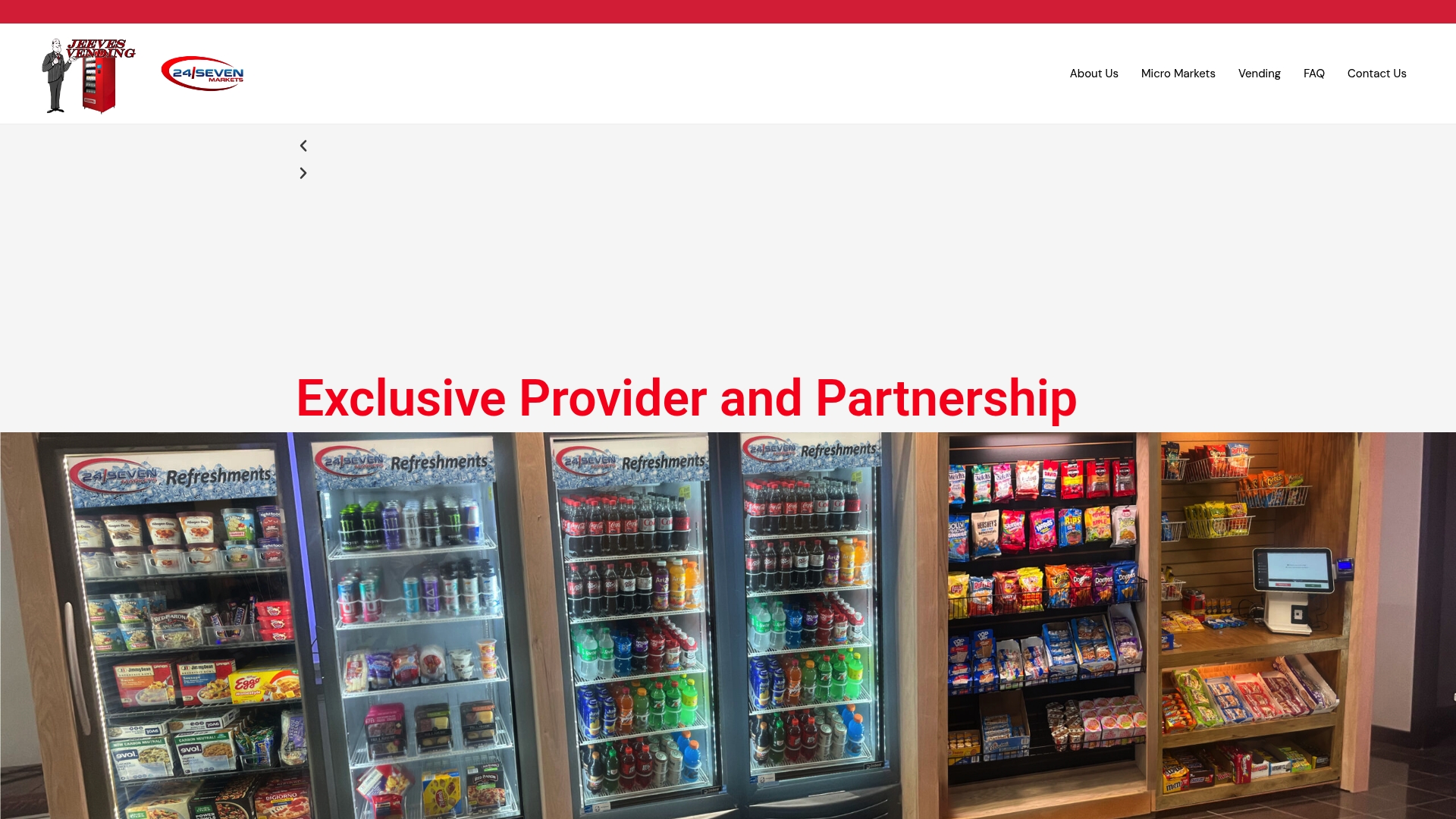
Facility managers get the practical wins that matter: no upfront equipment spend, ongoing maintenance handled remotely, and promotional signage updated to match whatever’s actually restocked that week. Whether you’re outfitting a break room, a gym lobby, or a hospital waiting area, the Free Full Service Vending Program covers installation and signage as one package instead of a separate line item. For a deeper look at how kiosk layouts cut daily workload, see the managed micro-market kiosk options. Ready to see what a design-led market looks like in your space? Site assessments can help map out signage, kiosk placement, and product mix together in one visit.
Sources
- Field experiment on digital signage and purchase behavior (2026)
- Does your micro market signage follow best practice strategies? | Vending Market Watch
- Digital menu board design: text size, contrast, item count
- How to fight product shrink in micro markets | Digital Signage Today
FAQ
Can you give me an example of a micro market?
A micro market is an open, self-checkout retail space typically found in offices, gyms, schools, or hospitals, stocked with snacks, drinks, coffee, and fresh food. Jeeves Vending installs custom micro-markets with kiosk checkout and digital signage tailored to each location’s traffic and product mix.
What is a sign outside a shop called?
Signs outside a retail entrance are commonly called storefront signs, blade signs, or entrance signage, depending on their mount style. In a micro market, the equivalent is the entrance kiosk screen or an entry header sign that greets shoppers and explains checkout.
How much does a micro market vending machine cost?
Pricing depends on machine type, size, and features, and current details aren’t published for a general readership. Jeeves Vending installs micro-market equipment at no upfront cost to the host business, with revenue coming from product sales rather than equipment fees. Contact Jeeves directly through its main site for a specific quote.
What are micro market kiosks?
A micro market kiosk is the self-checkout station where shoppers scan and pay for items without a cashier. Well-designed kiosks combine clear digital signage, short instructions for first-time users, and promotional content tied to what’s currently stocked, which is where Jeeves Vending’s managed kiosk systems focus their design.