


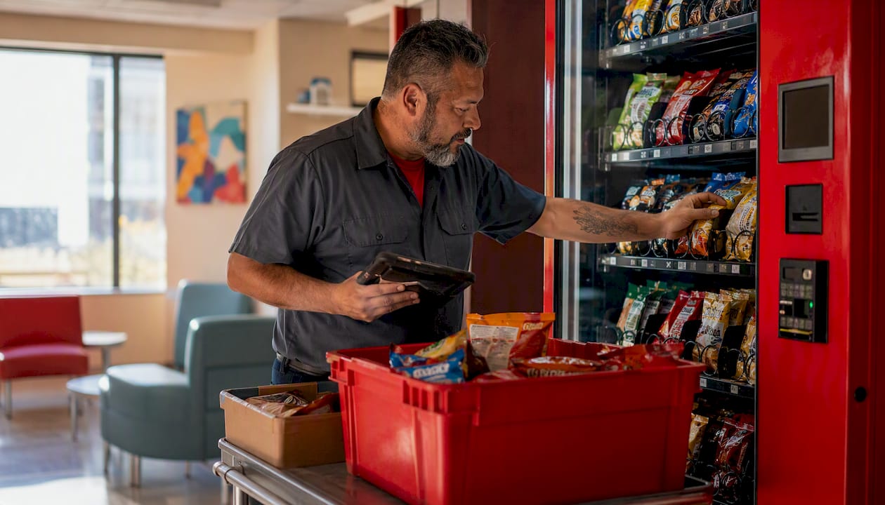
Peak-hour vending demand is the repeatable surge in transactions that happens within specific hourly windows at a given location. Think 7:00–8:30 AM at a factory break room, 11:30 AM–1:00 PM at an office building, or 9:00–10:00 PM at a 24-hour gym. These windows are not random. They follow shift schedules, meal breaks, commute patterns, and building occupancy rhythms. Once you identify them with timestamped sales data and real-time telemetry, you can act on them directly.
The immediate moves are straightforward:
- Enable timestamped transaction logging in your vending management system (VMS) if it is not already on. Every sale needs a date, time, and SKU attached to it.
- Check your telemetry dashboard for real-time SKU counts so you know which items are running low before the next peak hits.
- Prioritize restocking visits around confirmed peak windows rather than fixed calendar days.
- Run a modest time-of-day price test on one or two inelastic SKUs. Operators who apply time-of-day pricing to confirmed high-demand windows report average transaction value uplifts in the range of 5–15%.
Jeeves Vending’s connected machines are built for exactly this workflow: remote stock monitoring, digital POS integration, and telemetry alerts that feed directly into the analysis steps below.
Table of Contents
- Why tracking peak hours matters for your vending business
- How do you identify peak hours in your vending data?
- What technology reveals peak demand at your machines?
- How to analyze sales data to find recurring peaks
- Inventory and restocking tactics tied to peak hours
- Pricing tactics for peak demand: scheduled and dynamic pricing explained
- Which KPIs tell you if peak-hour optimizations are working?
- A real example: telemetry plus focused restocking in action
- Your 30/60/90 day plan to measure and act on peak hours
- Key Takeaways
- The part most operators skip
- Jeeves Vending makes the pilot easy for Dallas-Denton operators
- Useful sources and further reading
Why tracking peak hours matters for your vending business
A single stockout during a peak window costs more than the face value of the missed sales. A customer who walks up to an empty slot at 12:15 PM on a Tuesday does not wait. They leave, and if it happens twice, they stop trying. That recurring friction is invisible on a weekly revenue report but shows up clearly in per-hour transaction data.
The math is simple: if a machine averages 12 transactions per hour during a lunch peak and a popular $2.50 item stocks out 45 minutes early, you lose roughly 9 transactions, or $22.50, from that one SKU alone. Multiply that across five machines and four peak days per week, and the monthly loss exceeds $1,800 from a single preventable gap.
Waste runs in the opposite direction. When operators restock on a fixed schedule regardless of demand, they often top up machines that are still 70% full while a different machine across the building is running dry. Matching restock visits to actual demand windows cuts unnecessary trips and reduces the chance of product expiring on the shelf.
Venue type shapes the scale of the opportunity. Hospitals can generate $500–$1,200 per month per machine; factories typically land in the $300–$800 range. The gap is not just foot traffic. It is dwell time, shift structure, and how predictable the peak windows are. A hospital with three overlapping shift changes has three distinct peaks per day. A factory running a single day shift has one. Knowing which pattern your location follows determines how aggressively you need to manage inventory around those windows.
Understanding vending peak times also improves placement decisions. A machine positioned near a break room entrance captures the full lunch rush. The same machine tucked behind a storage rack misses half of it. Peak-hour data makes that difference visible in the numbers.
How do you identify peak hours in your vending data?
The process is more accessible than most operators assume. You do not need a data science background. You need clean hourly transaction records and a few hours with a spreadsheet or a basic dashboard.
Primary data sources to pull from:
- VMS transaction logs: the most reliable source. Every sale carries a timestamp, SKU, price, and payment method. Export these by machine and date range.
- Payment processor logs: if your machines accept credit/debit or mobile pay, the payment network often provides its own timestamped records. Cross-referencing these against VMS logs catches discrepancies.
- Telemetry and inventory sensors: real-time SKU counts show you not just when sales happen but when inventory drops below threshold. Smart sensors monitor SKU-level stock and notify operators the moment a slot approaches empty.
- Footfall counters: physical counters mounted near machines give you raw traffic volume independent of purchase behavior. The ratio of foot traffic to transactions reveals conversion rate by hour.
- Google Popular Times and mobile movement data: Google Popular Times provides hour-by-hour traffic patterns for many commercial locations and serves as a free pre-screening tool before you even install a machine.
The stepwise method:
- Export several weeks of hourly transaction data from your VMS. Too little data produces noisy results; very long periods may be unnecessary for initial peak detection at a stable location.
- Clean the timestamps. Remove test transactions, refunds, and any records with missing time fields.
- Aggregate by hour of day and day of week. A simple pivot table works: rows = hour (0–23), columns = day of week, values = transaction count.
- Visualize with a line chart (hourly totals across all days) and a heatmap (hour × day grid). Peaks stand out immediately.
- Flag windows where hourly transactions exceed your daily average by a set threshold. A reasonable starting threshold is 1.5× the average hourly rate.
- Confirm low-variability peaks. A window that spikes consistently across multiple weeks is a reliable peak. A one-time spike from a catered event is not.
For seasonal venues like college campuses or outdoor facilities, extend the baseline to 12 weeks to capture semester transitions and weather-driven shifts. Operators typically need several weeks of consistent operation before forecasting becomes reliable. Treat the initial data collection period as preparation and resist the urge to make major product mix changes during it.
Pro Tip: Before spending on footfall counters, run Google Popular Times on your location’s address. If the hourly pattern there matches your VMS data, you have a free corroboration. If they diverge significantly, a footfall counter will tell you why.
What technology reveals peak demand at your machines?
The gap between operators who manage peaks well and those who do not usually comes down to one thing: whether their machines are reporting data in real time or only when someone physically visits.
Core telemetry and VMS features to enable:
- Timestamped transaction logs (per sale, per SKU, per machine)
- SKU-level inventory sensors with configurable low-stock thresholds
- Remote price-update capability so you can adjust time-of-day pricing without a site visit
- Uptime and temperature alerts that flag machine faults before they kill a peak window
- Payment method splits (cash vs. card vs. mobile) which reveal buyer behavior differences by time of day
Ancillary data sources worth adding:
- Footfall counters near high-traffic machines
- Mobile movement data and Google Popular Times for pre-deployment location screening
- POS/payment analytics from your card processor, which often include hourly breakdowns at no extra cost
On cost: telemetry hardware (sensors, connectivity modules) is typically a one-time purchase, while analytics platforms and VMS subscriptions run on monthly fees. The ROI signal to watch in the first 60 days is simple: did emergency restock visits decrease? Did stockout rate during peak windows drop? If both move in the right direction, the technology is paying for itself.
Jeeves Vending’s smart vending machines come with remote stock monitoring and digital POS integration built in, which means the telemetry infrastructure is already in place for operators who partner with them in the Dallas-Denton area.
Pro Tip: When evaluating any VMS or analytics vendor, ask specifically for a demo of the hourly transaction heatmap. If they cannot show you a clear hour-by-day grid for a sample machine, their platform will not give you what you need for peak-hour analysis.
How to analyze sales data to find recurring peaks
Once you have clean hourly data, the analysis is a four-step pipeline that any operator can run in Excel, Google Sheets, or a basic dashboard tool.
-
Export and clean. Pull transaction records for your target date range. Standardize the timestamp format (YYYY-MM-DD HH:MM), remove refunds and test records, and confirm each row has a machine ID, SKU, price, and transaction time.
-
Pivot by hour and day. Create a pivot table with hour of day (0–23) on one axis and day of week on the other. Count transactions and sum revenue in separate pivots. This gives you two grids: one for volume, one for dollars.
-
Calculate key metrics per window. For each hour, compute:
- Transactions/hour: raw count from the pivot
- Sales/hour: sum of revenue in that window
- Peak hour ratio: (sales in that hour) ÷ (average hourly sales across all hours). A ratio above 1.5 is a strong peak signal.
- Sell-through rate: (units sold in peak window) ÷ (units available at window start). A sell-through above 60–70% on a specific SKU during a peak is a restocking trigger.
-
Segment by SKU, price band, and payment method. Aggregate-level peaks hide important variation. A $3.50 energy drink might spike at 6:30 AM while $1.25 chips peak at noon. Separating them tells you which items to prioritize for pre-peak restocking and which are candidates for time-of-day pricing.
AI-powered machines also track product interactions beyond completed purchases, flagging items that attract attention but do not convert. That data surfaces products worth repositioning or repricing before the next peak cycle.
For school and campus locations, segment by day of week separately from hour of day. Student vending patterns shift dramatically between Monday and Friday and collapse on weekends, so a weekly heatmap is more useful than a daily average.
Inventory and restocking tactics tied to peak hours
Knowing your peaks is only useful if your restock schedule reflects them. The goal is to arrive at the machine with enough product to cover the next peak window, not to top it off after the peak has already drained it.
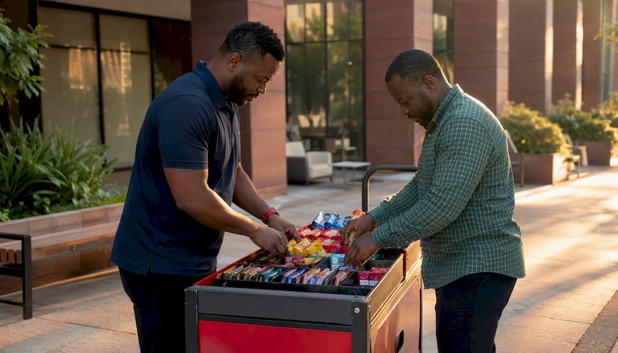
A simple safety stock calculation:
Safety stock is calculated based on peak-hour demand rate, restock lead time, and a variability buffer to cover higher-than-average demand days. For example, a machine selling multiple units during a lunch peak would hold a safety stock reflecting expected sales plus a buffer for variability.
-
Map your restock schedule to peak windows. A pre-morning restock (arriving by 6:30 AM) covers a 7:00–9:00 AM commuter peak. A midday top-up (arriving by 11:00 AM) covers a lunch rush. A late-afternoon visit covers an evening gym or shift-change peak. Not every machine needs all three. Let the data tell you which windows are large enough to justify the visit.
-
Use telemetry alerts to trigger emergency visits. Real-time inventory plus demand forecasting lets you shift from calendar-driven routes to demand-driven ones. Set low-stock alerts at an appropriate remaining capacity for high-velocity SKUs, and only dispatch a driver when the alert fires near a peak window.
-
Prioritize SKU placement by velocity. High-velocity items belong at eye level in the center columns. Slow movers go in peripheral slots. During a 90-second peak transaction, a buyer is not browsing. They grab what they see first.
-
Optimize routes across machines. Group machines by geographic cluster and peak timing. A route that visits three machines in the same building before 7:00 AM is more efficient than one that visits them on separate days. Route optimization tied to telemetry reduces operating costs and cuts emergency visits.
For hospital environments, where shift changes create multiple daily peaks, fast restocking cadence is not optional. A machine that runs out of water or energy drinks at 2:00 AM during a night-shift break loses sales that will not be recovered.
Pro Tip: Run a two-week experiment where you restock one machine strictly based on telemetry alerts rather than a fixed schedule. Compare the stockout rate and total restock visits against a comparable machine on a fixed schedule. The difference in emergency trips usually justifies the telemetry investment within the first month.
Pricing tactics for peak demand: scheduled and dynamic pricing explained
Most operators leave money on the table during their strongest hours by charging the same price at 12:15 PM as they do at 3:00 AM. Two approaches close that gap.
Scheduled time-of-day pricing means you manually set price rules in your VMS: item X costs $2.50 from 7:00–9:00 AM and $2.25 the rest of the day. No algorithm required. You define the windows, set the prices, and the machine applies them automatically.
Dynamic pricing uses telemetry signals (current inventory level, real-time transaction rate, time of day) to adjust prices automatically within operator-defined bounds. It is more responsive but requires a VMS with rules-based or algorithm-driven pricing capability.
A five-step experiment to run before committing to either:
- Pick one control machine at a location with a confirmed, consistent peak window.
- Define the peak window precisely (e.g., 11:30 AM–1:00 PM, Monday–Friday).
- Apply a modest 5–15% price increase on two or three inelastic SKUs during that window only.
- Run the test for a period sufficient to gather meaningful data. Track transactions/hour, revenue/hour, and total volume for the tested SKUs versus prior baseline data.
- If revenue per peak hour increases without a meaningful volume drop, expand the test. If volume drops more than 10%, pull back and try a smaller increment.
| Pricing approach | Best venue type | Key risk |
|---|---|---|
| Scheduled time-of-day | Offices, factories, schools | Customer complaints if not labeled |
| Dynamic (telemetry-driven) | Hospitals, 24-hr gyms, transit hubs | Requires capable VMS |
| Clearance/near-expiry pricing | All venues | Margin erosion if overused |
Demand tends to be price-inelastic in captive locations: hospitals, factories with no nearby alternatives, and 24-hour gyms where the machine is the only option. Those are the right places to test modest increases first. Dynamic pricing works best for clearance, targeted promotions, and modest peak-hour adjustments. Arbitrary or frequent price changes erode customer trust fast.
One practical caution: check your host agreement before changing prices. Some venue contracts specify maximum price points or require advance notice of changes. Label price changes clearly on the machine interface. A buyer who feels surprised by a higher price at checkout is a buyer who does not come back.
Which KPIs tell you if peak-hour optimizations are working?
Tracking the right metrics turns a gut-feel experiment into a defensible business decision. These six KPIs cover the full picture.
| KPI | Formula | Example benchmark |
|---|---|---|
| Transactions/hour | Total transactions ÷ hours in window | Baseline varies by venue; flag if peak window drops >10% week-over-week |
| Sales/hour (revenue/hour) | Total revenue ÷ hours in window | Target: 5–15% above pre-optimization baseline during peak windows |
| Stockout rate | SKUs at zero inventory ÷ total SKUs × 100 | Target: <5% during peak windows |
| Sell-through rate | Units sold in window ÷ units available at window start × 100 | >60% on high-velocity SKUs signals a restocking trigger |
| Average transaction value | Total revenue ÷ total transactions | Monitor for drop during pricing tests; a drop >5% warrants review |
| Machine uptime | Hours operational ÷ total hours × 100 | Target: high percentage during peak windows |
Run A/B comparisons between machines at similar locations: one with peak-hour optimizations applied, one without. Four weeks of data is enough to see directional movement on all six metrics. When stockout rate drops and sales/hour rises simultaneously, the optimization is working. When average transaction value drops alongside volume, the pricing increment was too aggressive.
A real example: telemetry plus focused restocking in action
The pattern plays out consistently across venue types. Here is a representative scenario based on how the approach works in practice.
Before: An operator running machines at a mid-size office building restocked every Monday and Thursday on a fixed schedule. Stockout rate during the 12:00–1:00 PM window ran high on Wednesdays and Fridays. Revenue per machine was flat despite steady foot traffic.
Interventions applied:
- Enabled timestamped logging and pulled four weeks of hourly transaction data
- Identified two consistent peaks: 8:00–9:00 AM and 12:00–1:00 PM, with Wednesday and Friday lunch peaks running 40% higher than Monday
- Shifted one restock visit from Monday to Wednesday pre-noon
- Applied a 7% price increase on two energy drink SKUs during the morning peak only
- Set low-stock telemetry alerts at 25% remaining for the five highest-velocity SKUs
After (measured over the following four weeks):
- Stockout rate during peak windows dropped from above 10% to under 4%
- Revenue per machine during peak hours increased, driven by both the pricing adjustment and the reduction in empty slots
- Emergency restock visits dropped because telemetry alerts replaced reactive guesswork
Lessons:
- The pricing test worked because the location was semi-captive (no café within easy walking distance)
- The biggest single gain came from the restock schedule shift, not the pricing change
- Results will vary by location, customer mix, and how consistently the peak windows hold across weeks
Note: specific revenue figures for Jeeves Vending client locations are available upon request. The scenario above reflects the operational pattern; actual client data and case studies can be inserted here.
Your 30/60/90 day plan to measure and act on peak hours
A staged rollout reduces risk and creates a repeatable playbook you can apply to every new machine.
Days 1–30: baseline and pilot
- Enable timestamped transaction logging on all machines (or at minimum, your highest-revenue location).
- Run Google Popular Times on each location address to get a free hourly traffic proxy before your own data accumulates.
- Export the first two weeks of hourly data and build a basic pivot table. Identify candidate peak windows even if the data is not yet statistically stable.
- Pick one machine for the full pilot. Confirm telemetry is active and alerts are configured.
- Cost and time: primarily operational time (4–6 hours for setup and initial analysis). Hardware costs depend on whether sensors are already installed.
Days 31–60: expand and experiment
- By now you have 4–6 weeks of data. Confirm peak windows and calculate peak hour ratios for each identified window.
- Adjust the restock schedule for the pilot machine to align with confirmed peaks.
- Run a 5–15% time-of-day pricing test on two to three inelastic SKUs during the strongest peak window.
- Expand telemetry to your next three to five priority machines.
- Cost and time: subscription analytics or VMS upgrade fees if applicable; 2–3 hours per week for monitoring and route adjustments.
Days 61–90: scale and automate
- Review the pilot KPIs: stockout rate, sales/hour, and average transaction value versus the 30-day baseline.
- Scale pricing adjustments to additional machines where the pilot showed positive results.
- Automate telemetry-triggered restock alerts across all connected machines.
- Review host agreements for any pricing notification requirements.
- Calculate net revenue uplift versus the pre-pilot baseline and document the playbook for new locations.
- Cost and time: primarily route optimization savings offset against any new subscription costs. Expect the net position to be positive by day 90 if the pilot validated the peak windows correctly.
Starting with one validated machine reduces risk and creates a repeatable playbook for additional locations. Do not scale pricing or restocking changes to your full route until the pilot data confirms the approach works at your specific venue type.
Key Takeaways
Peak-hour vending demand is predictable, measurable, and directly monetizable once you have four to six weeks of clean hourly transaction data and telemetry alerts in place.
| Point | Details |
|---|---|
| Enable timestamped logging first | Every optimization depends on clean hourly transaction data; turn it on before anything else. |
| Collect 4–6 weeks before acting | Reliable peak detection requires at least four weeks of consistent data to separate real patterns from noise. |
| Align restocks to peak windows | Shifting one restock visit to a confirmed high-demand day often reduces stockouts more than adding a new visit. |
| Test pricing on inelastic SKUs only | A modest time-of-day price increase on captive-location items can lift average transaction value without hurting volume. |
| Jeeves Vending in Dallas-Denton | Jeeves Vending provides telemetry-enabled machines and targeted restocking at no cost to host businesses, making the pilot approach accessible without upfront hardware investment. |
The part most operators skip
The operators who struggle with peak-hour management are not usually missing the data. They are missing the habit of looking at it by hour instead of by week. A weekly revenue report hides everything. It averages out the Wednesday lunch crash, the Monday morning stockout, and the Friday evening pricing opportunity into a single number that looks fine. Fine is the enemy of better.
The shift that actually changes things is treating your VMS the way a retailer treats a point-of-sale system: as a live operational feed, not a monthly accounting tool. When you start checking hourly transaction rates the same way you check a weather forecast before a route, the stockouts stop feeling like surprises. They become predictable events you can schedule around.
There is also a tendency to overcomplicate the pricing piece. Operators read about dynamic pricing and imagine complex algorithms. The reality is that a simple scheduled rule in your VMS, raising one SKU by $0.25 during a 90-minute window you already know is inelastic, is dynamic pricing in practice. Start there. The algorithm can come later, after you have confirmed the window holds and the customer base does not push back.
Seasonality deserves more respect than it usually gets. A campus location that looks like a strong performer in October can drop 60% in December. A gym that peaks at 6:00 AM in January may shift to 7:30 AM by March as resolution-driven members drop off. Build a quarterly review into your calendar. The 30/60/90 plan gets you started; the quarterly review keeps the model accurate.
Jeeves Vending makes the pilot easy for Dallas-Denton operators
If you are running machines in the Dallas-Denton area and the 30/60/90 plan above sounds right but the setup cost feels like a barrier, Jeeves Vending removes that barrier entirely. There is no upfront equipment cost for host businesses, and the machines come with remote stock monitoring and digital POS integration already built in.
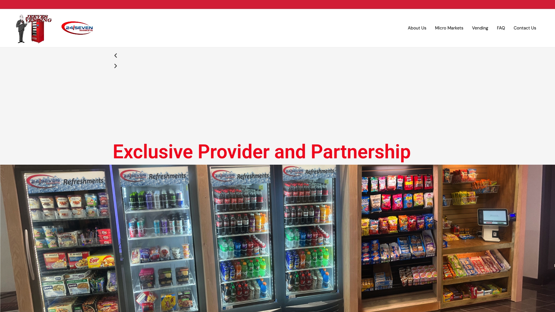
A pilot with Jeeves Vending includes telemetry enablement from day one, a 30-day baseline data collection period, a targeted restocking and pricing experiment in your confirmed peak windows, and a results review with KPI reporting so you can see exactly what moved. The smart coolers and connected machines are already configured for the hourly transaction logging and SKU-level alerts this article describes. For locations where a single machine is not enough to handle peak demand, micro-market solutions are also available.
If you are ready to run the pilot or want to talk through which machine setup fits your location, contact Jeeves Vending directly to get started.
Useful sources and further reading
These references are worth bookmarking as you build out your peak-hour measurement and pricing program. Always verify that any vendor you evaluate offers US-based support, transparent uptime SLAs, and a demo dashboard before committing to a subscription.
- Vending Machine Product Demand Prediction Using Machine Learning Algorithms (King Fahd University of Petroleum & Minerals): the most rigorous academic treatment of ML-based demand forecasting for vending, covering XGBoost, FB Prophet, ARIMA, and Support Vector Regression. Read this for context on what predictive restocking models actually require in terms of data history and feature engineering.
- How to Use Dynamic Pricing in Vending Machines to Increase Revenue (Neuroshop): practical operator-level guide to scheduled and rules-based pricing. Use it when designing your pricing experiment protocol and setting uplift benchmarks.
- How AI Vending Machines Use Real-Time Data to Pick Their Best Location (VMF USA): covers footfall proxies, mobile movement data, and Google Popular Times as pre-deployment screening tools. Read before placing a new machine.
- How AI Vending Machines Optimize Sales (VMF USA): explains the 4–6 week data collection baseline, route optimization via telemetry, and the operational shift from calendar-driven to demand-driven restocking.
- Handling Vending Stock in Peak Time (Vending-Machines.ie): focused on smart sensor alerts and real-time inventory management during high-demand windows. Note this source is Ireland-based; verify that any vendor it references offers US support before contacting them.
- When Are Vending Machines Most Profitable? Locations, Timing & Placement Guide (VendingCore): venue-by-venue profitability benchmarks including the hospital and factory revenue ranges cited in this article. Use it for placement scoring and dwell-time comparisons.
When evaluating telemetry vendors: ask for a live demo of hourly transaction heatmaps, confirm that low-stock alerts are configurable by SKU and threshold (not just machine-level), and request references from operators running similar venue types in the US. Trial periods of 30–60 days are standard for reputable platforms. If a vendor cannot offer a trial, that is a signal worth taking seriously.